Showing posts with label mixed media. Show all posts

Tuesday, May 1, 2012

Sticky, Delicious Golden Graphite Gray

Ah Golden's.....my love, my weakness!


Yes, I am entirely too mushy about my art supplies. But I love Golden's products. They just make the coolest things! (and I'm pretty sure I have made a significant contribution to their retirement plans....)
Okay, so you ask, "Anne, why is a tube of Gray Paint so exciting???"
(I see you nay-sayers out there...)
Well, because of the word *graphite* being included with it. This is a paint with some properties of a pencil, and the ability to transform into something spectacular. 
Hey, trust me. Don't burst my bubble...

Sticky, ooey, gooey....

First off, one thing you'll notice is the consistency of Graphite Gray. It is, well, dense and sticky. I am not sure how well it would handle in fine application, but the way I've used it (and a few other ways I plan to try) have lead to success. 
You'll need some high-tech tools for this~~
Waxed paper for your *palette* and the following:

Praise for CHEAP WINE!
Yep, that's right, a fake wine bottle cork. Or a non-cork bottle stopper. Whatever you want to call it. The material it's made of makes interesting pattern in the paint.
I put a bit of paint out on waxed paper, smeared it about a little with an old brush, then loaded the cork as you would any stamp, except I kept the paint application thicker. You want some density on there.
Then stamp randomly. (I also used Gesso to do some spots)

Just a little DOTTY.....
The very middle, dark *dot* is the paint, dried in it's natural state. You can see the fake-cork provided a nice pull-up design in the paint.
Now for the fun part.
Wait---the not-fun part first.
WAIT UNTIL THE PAINT IS TOTALLY DRY BEFORE PROCEEDING.
Go eat a Pop-Tart or solve the issue of World Peace or twiddle your thumbs, but don't mess with the paint until it is DRY. (a hairdryer is allowed--no heat guns)
Okay, back to the fun part:

What dust cloths are REALLY FOR....
When the paint is dry-dry-dry, get a soft cloth you don't mind getting dirty. I use dust cloths, as they don't seem to get much use in the house, but they sure do in the studio.
Wrap a bit of it around your fingertip and rub that paint HARD. Burnish, burnish, burnish!
What you will see is that the paint is beginning to take on the characteristics of lead pencil that has been smudged. and yes, on some papers, there will be a bit of the graphite that bleeds over, and sometimes it can actually be erased too!
The longer you work, the higher the shine:

Is it a TREE? NO! It's shiny Graphite Gray!
And the best part of the thick application with the faux wine-cork-stamp is seen above~~a very organic pattern that burnishes up brighter and no two will be alike.
Actually, you could use any solid stamp for this; square, oval, heavy lines, etc. I am assuming it could also be painted heavily around a collage section where more emphasis is desired. I mean, my little mind is spinning at the possibilities! (yeah, more than it usually spins, thank-you-very-much!)
So if you want to add one small supply to your art-arsenal, give this one a try.
I think you'll love the versatility.
I do.
You could tell? ;-)


Pax....

Wednesday, April 11, 2012

Living Color Continued a.k.a. There Are NO MISTAKES!


*Sigh*
That photo says it all. I've been out of the loop long enough that when I went to grab a crackle medium, I got the one I really DISLIKE as opposed to the one I *LOVE*.
And I smeared a lot on, with delight, until the brain slowly creaked into gear and this thought wandered through...."Anne, this is way too thin....it doesn't feel right...."
omg...I then read the label closely.
I began swiping as much as possible off the BG color and had to let it sit and dry. Next day it looked workable and I put on the RIGHT ONE:


....Along with some microglitter blown into the damp surface of the crackle medium. (uncap the bottle, hold close to mouth and gently blow across top--you'll get a very fine distribution of glitter) You can see the light pink in the top layer.
It was hard to choose what color I wanted:


Yes, you can have a few too many choices.....
I hit the wet surface with a hairdryer to help get the crackling going as my patience was running thin and I kept thinking about the MISTAKE stuff that was underneath.
But sometimes, THERE ARE NO MISTAKES.


I really couldn't see the results that well until I put a wash of dark over the crackle~~that *mistake* medium had made the other one work perfectly! I would have never considered using them together, and since I have several bottles of the one I don't like so much, this was GREAT!
As I said, NO MISTAKES!
LEARNING EXPERIENCES!!!


I applied some lettering (another adventure because the surface was very slick, but pattern tissue and medium weight matte gel did the trick) then finished off the bottom with decorative upholstery tacks, copper wire and beads.
And the finished piece:


I was happy with how everything came together after adding the spoons. Had to make a frantic call to my dear friend Jan at Laughing Dog Arts to figure out how to attach said spoons as the insulated staples I was using were loath to go into the wood panel nicely. Jan is much calmer than I am...she said, "A small nail for a pilot hole?"
Thank you....perfect. *whew*
So, happy art finished and mailed out, recipient happy, I *can* still make art so I'm happy, and there are no mistakes really.
Although the amount I had working on this piece sort of pushed that envelope as far as possible, I think.  ;-)


Pax....

Sunday, September 11, 2011

Putting Good Out Into The Universe.....

Today the sewing table is temporarily transformed into an art table again. I will be doing a tele-class with Sarah Bush at 3:00 p.m. today, and wanted everything ready to go. The piece of art on the right is what came out of the last class~~it hangs in my kitchen and brings light to my life daily.


Other goodies in order and waiting:

 
A limited palette plus collage medium and an assortment of well *loved* brushes. A big tin of different pens for mark making.


Stamps, die cuts, ink pads, a preview of two papers I hope to use......


Other papers at the ready, along with scissors, though usually I just tear as it provides a softer edge.
No TV, no news, no bad energy going out.
Just good energy from art, in hopes that somewhere there is a little more it can connect with, and a bit more, and a bit more.
And that we can finally move past tragedy into healing and peace.


Pax....

Friday, July 22, 2011

At Last......Art.......


Sometimes, no matter how hard you try, art does NOT happen.
I had started this piece quite by accident when I was finishing up my Michael DeMeng Colorwash Class. See, that tin *was* a saddle soap can with openers on the side. I think I was trying to soften up my Doc Marten boots when I discovered the soap had totally gone kaput.
The tin was rusted exceptionally well, and after my initial fit that I didn't have saddle soap, I looked again at the beauty in the rust; something normally to discard, but all I could see was a shrine shape.


So the round part was done. And then it sat......and sat.......and......SAT. I knew I wanted something on top and I knew eventually it would be free-standing on a slim metal pole attached to a fancier base.
Fast forward to, well, TODAY. It was too hot to sew, too miserable to do much needed work in the yard and I see this piece, begging for attention.
Guilt, my dear readers, GUILT propelled me to go to the cellar and dig through boxes of *stuff* (M.A. part of that digging was through the box of metal bit you sent!!!) and finally found a fancy metal piece that could be altered for  a finial.


It was originally gold and shiny like the piece on the left (which I am sure will work itself into the base somehow) but with some folding and nipping and paint washes and the heat gun, I had the aged and lovely crown.
Ah yes, that was what I was looking for!
And close ups~~the interior with a paperclay stamped piece, with tons of mediums and paints.....please don't make me try and think what I used...


I did use Kroma Crackle on this; there is a learning curve to the medium and I am still curving and learning.


But this, the face on the front.....this is what I wanted, exactly. The soft glowing kindness, the gentle color, the crackle of age.
For whatever reason, I was reminded of Orthodox Icons and then I thought about the Hagia Sophia's beautiful round domes...my mind was pulling together all the wonderful remnants I have seen from archeological digs, and thus, this piece in process.
I now have to find both *stem* and *base* but this has motivated me to look, and to finish.
And by the way, this Sunday, please stop by Seth Apter's incredible, great art blog, "The Altered Page"....


....because I will be part of The Pulse, in Style File! 
If you love mixed media, Seth's blog is a MUST to follow. He does amazing work and is constantly introducing new artists there.
Anyway, I've rambled enough.
I just want to say.....art felt really GREAT today!
Wishing you beautiful visions, inspiration, and all the style you could ask for! And of course....


Pax....

Monday, May 2, 2011

Good Art News!!!


Today I shipped off two boxes of art I had been frantically working on after being accepted into a delightful gallery in Missouri, and the best part is two other bloggers are there also! Silke and Cathy both will have work hanging along with mine and I couldn't be happier! (and I know they are excited too~~check their blogs to take a look-see at their work)
I know the blog has been a bit ignored of late, but I have found that I can only manage so many irons in the fire at once anymore.....LOL! And painting/mixed media always seems to come first, leaving me little oomph at the end of the day.
The piece above is paint, paper, pastel.....a lot of mixed media fun despite the short deadline. Of course, trying to get things to DRY was a bit interesting, to say the least!
So here's to those of us who rose to the occasion and put our art out there, and here is to Kathleen for giving us the opportunity to show!
BRAVA!
All of us..... ;-D


Pax....

Monday, April 18, 2011

Stamped Tissue Paper....Second Life!

Disclaimer: no tissue paper was hurt in this tutorial, even though they were flattened, ironed, cut, and stamped into submission!


Well, I had to start with a little humor; I'm a bit punch~drunk from all the different papers I've dealt with lately!


First off, all the tissue used here is recycled. The wrapping from a pair of Doc Martens, package wrap, fancy napkins with the other three plies removed~~you name it, I save it. So gather some different types, read a bit and kick back; this is all as easy as....


ONE, TWO, THREE!!!
Stamps consist of three types:

Text
Semi-Solid
Linear
Those are pretty loose descriptions as you can see above. I want text you cannot read for a texture layer, a semi-solid stamp for some punch and then something linear to tie it all together.
Lets see what the text looks like as we begin randomly....

I start on the non-printed side; the ink will be visible on the front, although front and back are relative terms here. Which ever you like best is the front. Two sheets with the first stage of text on them. They will be mostly covered before moving to the next set of stamps.

One note before I go on. Usually I stick with Timber Brown and Black Staz-On ink due to the fact the neutrals blend with any color, but this paper with the bright red dots HAD to to have some red.....those dots needed a little competition. (well, a LOT really!)


So after the initial layer of red, I started working in black, adding depth to the stamped layers. (these are the semi-solid stamps helping to break up the red)

And then I add the linear elements to completely tie it together.
The final sheet~~pretty, different, still dotty but not to make your eyes cross. This was the paper I considered the biggest challenge to transform to *good* so that is why I picked it to do the step out pics with.
Also, I chose to stamp on both sides of the paper. Staz-On will be quite visible on the back/front and it helps to give everything a bit more oomph by doing both sides.
Next is the simplest; 1 ply of a printed napkin, 1 stamp, 1 color.


Timber Brown on the reverse and if I had thought, I would have added a butterfly stamp, but I didn't think. So we have spider webs.
It's okay.....just think how they'd look covered with dew!

This is the Doc Marten paper, finished with brown and black. Somehow, these stamps all seem to work with the Doc's image! I was just grabbing things to fill the space and seemed to luck out.
Don't over think most of these. They will be better just randomly picking and stamping.
Of course, there are exceptions....

Like this.
The bold stripes needed something totally different, and though it does not show there is a slight pink cast to the paper, so I went for feminine lines and shapes and brown ink to tone it down a bit. It transformed the very formal paper into something you might find in a frilly boudoir.
And then this one needed THOUGHT and special placement of stamps.....

The very strong pattern of the rose stripe made me feel that laying out the text background more carefully was essential, or there would be so much going on visually that it would be bedlam. And brown again seemed the logical choice to soften the edges.
So the two text stamps alternate, then I added linear and finally semi-solid. This was the exception on the order, but then that's the whole thing, isn't it? To take what you have on hand and make it work.
And what do you use these for?
Journals, collage, ATCs, envelope liners, part of the front of a greeting card.....anything you can think of where you want a translucent paper.
Remember when collaging that these are delicate and will tear easily. Use the driest medium you have to adhere them, pat them in place and expect a few wrinkles.
And all the ink you applied will show through amazingly!
I suppose I should have called them "Tattooed Tissue" but I figured I would run you off....  ;-)
Now, have fun and I am off here for a few days with some other work I must finish up!


Pax....

Thursday, April 7, 2011

"Reliquary Memoria"

This is one of those good/bad posts. 
I am delighted I can finally show this piece of art I labored over during the winter on a short deadline (well, short for *me*~~LOL!) but the reason I can now post it is.....it was not chosen to be included in a publication. So you, my gentle Readers, get the unveiling of "Reliquary Memoria". 
The pertinent details follow. 

Sorry for the watermarks..... 
A little more detail....
All the little tidbits....a dry seedpod from a ground cherry, a broken brush and pencil, a shaped penny from NOLA....
Milagros, bottle caps, gold mica gel, my favorite angels.....
Live Oak acorn, split and framing the NOLA Cemetery imprinted on a penny...bone and watch parts.....
"Reliquary Memoria"
17" h. x 10" w.
Materials:

-heavily gessoed cradled wood panel and mini canvas
-metal leaf
-paper
-acrylic paints and mediums
-glass beads, glitter and small vials
-wire
-crushed bottle caps
-milagros
-bone
-pen nibs
-flattened pennies
-plant matter
-mica gels
-paper clay
-crackle medium
-shells
-watch parts
-commercial charms

"Reliquary Memoria" is a repository for many things I have collected, found sacred and held close to my heart. Blue bottles from a Southern heritage of bottle trees, nods to both traditional religion and religions much older and more visceral, the tidbits of nature I collect and hoard in the studio, items either from New Orleans or that represent the unique culture, the passage of time that none can avoid. My love of traditional icons and roadside shrines is evident in the basic shape of this piece. We are defined by simple things in complex variations; the sum of diverse parts that appear to equal nil, yet reflect the core of our soul.


And so it is......


Pax....

Tuesday, March 1, 2011

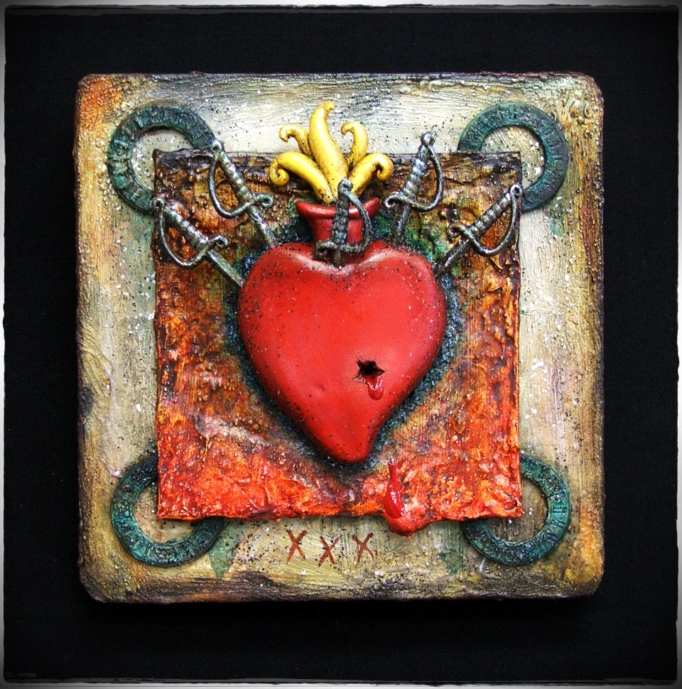
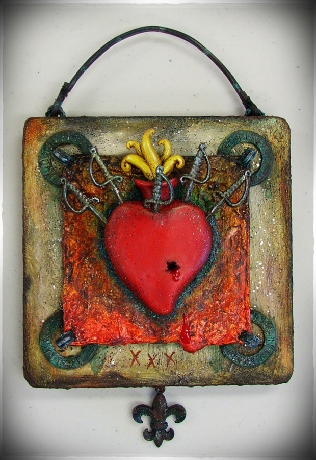
Final Treatment of Heart And Daggers

Final treatment......happy Anne!
I did not realize, as I have been in way too much of a rush lately, that I had not posted the photo of the completed "Heart and Daggers". I finally mounted it on a birch cradled panel, rounding the edges with my handy dandy bench grinder and then had a ball with techniques I learned in Michal deMeng's class.
I had to jump out of the box, and this is from a girl who seldom is IN a box, let alone knows whether she owns one to stand in! LOL! I went for my hardware drawer in my table upstairs and one in the cellar and pulled any likely suspects out. There spread before me were insulated staples, tacks, wires, washers.....you name it. I was treading into uncharted territory! I was on a MISSION!
I didn't really have a clue what I was doing......
I knew I wanted a specific feel for the background, so painting that wasn't too hard. 

"New Orleans Tomb" color combo....neutral, effective.....
And I had treated some of the insulated staples and washers with molding paste, so that seemed okay.
I just had to put it all together....
Normally my work consists of everything being held together with Golden gels, but this piece had a bit of heft, so I thought, well, if I use the washers, I need another *industrial feel* piece to accent them, and the insulated staples did the trick. Series of washes had brought them up to the nice *Crypt Corrosion* color and when I had the piece drilled, hammered, swathed in paint and all together, I liked very much.

*Crypt Corrosion*~~doing it's thing! Left panel shows the layers of color washes

It's okay, but just not quiet there......not tied together enough.
But it still needed a hanger and if there was something sticking out of the TOP, then there had to be something to balance out on the bottom.
I had changed out an old chandelier in the living room before the holidays, and still had the monster sitting around because I wasn't sure what to do with it. But the clear gold wire was perfect to take paint with the help of some heat, and it became the hanger on top.

I knew that butt-ugly chandelier was good for something....WIRE!!!
I had rooted around and found (while looking for other things...oy!) some cool Fleurs that I had bought with the intention of jewelry, but I grabbed one of those and went to work on it, aging and corroding.

Insulated staples *holding* things together; lovely, aged Fleur.....Oooooo! Too good!
What destructive fun! :-D This is right up my alley!
So, the final piece is greater than the small work I had originally. I was hoping to not overpower it, and by keeping colors somewhat neutral, it worked. Everything fell into place.
I was also hoping to not hammer the wrong thing while putting the corner staples in; I did NOT know how I would replace a broken plastic sword.....
The gods of industrial tools were smiling on me......
(except that one that rules the heat gun, and he is a little STINKER......)
Now go make art! Have fun~~get outta the box!


Pax....

Sunday, February 13, 2011

A Valentine Unlike Conventional Hearts

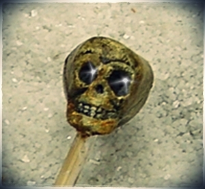
Remember that ornery little skull??? Well, he was MOST DEMANDING as far as being dressed properly......
I promised a finished piece from one of the samples I had used in the gel tutorial, and here it is. I am hoping--reeeeeeally hoping!--that today is NOT the day DH decides to look at the blog, because it is my gift to him tomorrow.

HA! I won! Free makeover, and now I be a Pirate Skelly!!!
That ornery little skull I had to keep an eye on was just a pip to dress properly. He was totally into the Cap'n Jack look.......what's a girl to do??? Just give in and dress 'em! LOL! And I had to have just the right bone to hang from the bottom, plus I couldn't find the coins I wanted and settled for this one. It's okay, but you know how it is when you want something else and can't find it. I need those shelves like they used to have in garages; all the little jars with their lids nailed to the shelf. Believe me...SOME DAY!

And, providing I am not laid lower with this current migraine, I want to put a little something fun up here for my readers on Valentine's Day itself....
This has been a delightful journey through process; I'm not sure how I will follow it up.
I may have to take a few days off and get back to work hard on my Michael deMeng class. I have enjoyed that thoroughly and it soon will end. I am hoping he will have another, because I would sign up immediately. How ideal; work in your own studio and get the benefits of class time when ever you have free time. Economical, fun, educational.
In fact, a goodly portion of what I learned from the class made this Valentine. I could have done one without it, but numerous techniques are in the final product that I learned along the way, between the laughs.
That's what I always hope to provide here, laughs and some learning fun!
So I'm out of here for now~~and remember, love isn't just for Valentines Day or for a Sweetie~~it is for everyone.


Pax....

Saturday, February 12, 2011

The Divas And Their Stories......


Well, you get a bunch of show-offs together and you know what is going to happen.....*sigh*
These are four gels I have that, quite frankly, are unique and really cannot be duplicated. I will start on the far right with the Large Gold Mica Flake.
It is exactly what it says; large, gold, flake.
A little goes a long way. In fact, I usually reduce it some with extra soft gloss gel, so there is not as much of the gold. It will spice up any mixed media, but use in small quantities. I can think of nothing that would look like this to add to a regular gel. Put it on your wish list.
Next to Goldie, we have Pearl. Pearl is much easier to deal with and an easy going personality. In fact, Pearl likes to go everywhere before you know it. It is an extremely soft gel, and is densely pigmented with very fine pearl flake. You'll love Pearl, but you'll love her better in small quantities...if you know what I mean! *ahem*
Our next candidate for Diva is the Clear Tar Gel. And honestly, the *tar* part is more accurate than *gel*. It is a bit like molasses in January in texture; it will pour, can be colored with paint (the actual dilution ratios are always on the containers) and makes a killer coloring for the inside of glass things, like tiny glass bottles. Add some blue, stir, coax into the little bottle, swirl around and when it dries, you have what looks like cobalt glass. Or pour in something as simple as a shell, and when dry, you have *water*. Amazing..... *CTG* is a straight shooter, just give her time to dry. A lot of time and low humidity! (I mean, humidity makes us all a little flustered, fuzzy and frizzy, right?)
And now, the Diva of Diva's; Crackle Paste. You cannot---I repeat---CAN NOT make this medium do anything other than what it is made to do and that is crackle, on it's own, with NO HELP in drying, and nominal humidity while in drying process. It is temperamental, demanding, must be sealed to stabilize, can be colored to a certain extent, but not as much as some of the others......so why should you buy this?
Because a beautifully finished crackled piece cannot be beat for pure age and texture. It is the crazed finish on you grandmother's china, it is the worn stucco on old buildings, it is plaster in the process of neglect. It is just plain amazing.
Be brave and submit yourself and your art to this demanding Diva. She is worth it. Bow low and read her instructions and prepare to be dazzled.
In all seriousness, it has taken me time to acquire the four above due to cost. If you want to try one, get the smallest container made, give it a whirl or if you have a friend who lives close and wants to split the cost, go that way. Don't be frivilous  with these; they're just too expensive to use once or twice and then set aside with the possibility of drying from not being used.
One tip; keep that inner foam seal that you have to pull off when they are new. Pop that in the top of the lid and that helps immensely in keeping them fresh.
Petroleum jelly, on the top of the bottle will make the lids easy to remove.
Keep dirty brushes or wet items out of the gels as that can affect the longevity of the product.
But use them.
And visit Golden's website for tons and tons of information on their absolutely amazing product line.
And no, they're not paying me to say that. (I wish they were....it's more like the other way around.....LOL!)
Thanks for following this along. Tomorrow I will post the one finished piece from the test samples, and you can see the possibilities.
Hey.....get gellin'!!!

Pax....

Friday, February 11, 2011

One Last Splash Of Glitter........

I know this cannot compare with the last post, so let's not even go there. No eye candy, just nominal art.
*SIGH*
Sorry kiddies.
Alas, a boring heart....no Pirates.....
As with most of what I do, occasionally things just take off in another direction and it is NOT what I had in mind. This is the case with the post today; the four heart stencil that seemed like a good idea but was a devil to pull.
I started with a simple scrapbook paper heart, then wanted to use the gold German Glitter for contrast. I do want to add here that the gold glitter is made up of metallic glass and yellow tinted glass, which disperses color when added to the soft gloss gel. (as I found out....)

I did tape this stencil due to wanting straight placement....I could just see it take off....NOT.
Well, first off, I almost could not get the stencil OFF. I mean, those little edges were just not nice at all. I pulled and gently wiggled, and added some spicy words to see if that would help (it did NOT, btw....), stomped my feet and threw a little fit.
After a bit more easing, I finally got the foam off and had to readjust the edges of the gel with the palette knife. Yes, you can do that. It requires a light touch. A very light touch......and yes, the temptation to throw this one in the trash occurred to me several times.


But I decided to let it dry and see what would happen. The problem was simple; I had put so much gel on, it ended up drying without the paper showing through as I had envisioned. So, lesson learned. If you want the glitter AND the background to show, don't pack it so full.

Yeah, yeah, it could be worse....maybe not.
Hmmmph.
While I was waiting and waiting (and waiting.....) for this to dry, I decided to do a very unsophisticated sample chart so everyone could see the other possibilities for additives to gel. I even remembered to write on the back what I had used.....will miracles never cease.....LOL!


1. Fine German Glass Glitter in black

2. Black glass beads (no holes)

3. Fine German Glass Glitter (black) mixed with Budgie Grit

4. Used and dried green tea from tea bags


5. Used and dried coarse loose tea

6. Crushed flakes of leftover mica sheets (they're too expensive to waste!)


7. Gold German Glass Glitter (notice the yellow bleed into the gel)

8. Commercial Golden Black Mica Gel Medium


I wanted to put one of the specialty mediums on the board to see how the other items stood up visually against the real deal. And frankly, I think they do okay. #3 probably comes the closest to the Mica Gel, but it also has a lot of the texture of the pumice gel when you touch it. I probably should have done a wash of paint over half of each sample, but remember, it's ME and I have a short attention span. (and I've been working on several other things at once too....ack!)
I will say the coarse loose tea is wonderful if you are doing a 3-D type area and want to imitate weeds, twigs, etc. Just add the right color paint afterward.
Next post, I will wrap this up with the one completely finished canvas, so that you can have an idea of where these can be taken. I am really hoping my husband does not decide to check the blog, because it is his Valentine gift and I would like to surprise him......*wink*!!!
I've had fun with this tutorial, and hopefully you have been able to learn a bit along the way.
Of course, gel medium is one of the best collage mediums out there, though I recommend matte for that purpose. I probably will do one post on the Diva Gels; the ones you cannot mess with, but are worth the cost.
It won't have cool pictures of Cap'n Jack.
Life is hard.
Sometimes you just have to deal with words. ;-D
Okay....one more piece of eye candy......


"I likes me gel additives too...Savvy???"

Now go make art!


Pax....