Showing posts with label fluid acrylics. Show all posts

Wednesday, April 13, 2011

Old Paper Rejuvenated

Learning from mistakes....that is how this part came to be. I kept thinking of the skulls in yesterday's post and how they had gotten all sloppy from the wash seeping into the back of the paper, and knew that OLD book paper would be much more porous.....so out came the clear gesso.


I completely covered the backs of the book pages with the clear gesso and let them dry. The paper does curl, so once completely dried, they got a quick ironing to flatten and then were ready for stamping on the front.
Due to the text, I chose one of my larger stamps....

Same gesso routine....spread it out even....

Stamp firmly....
PRESS....REPEAT TO COVER....

And your finished, stamped page should look something like this. I recommend using a dryer on this, as the foam stamps pick up more gesso and those little thick places will take quiet a while to dry on their own.
No photos of watching gesso dry...I mean, I'm sure that would provide too much excitement....LOL!


When starting to paint these, you will find that the paper absorbs the wash at a very fast rate, BUT, that gesso on the back keeps it from seeping through. So paint a section at a time and blot off as before....


....And you will end up with a very definite pattern showing and all the text and also *texture* of the original paper coming through too. And yes, the back side of the paper will be pretty clear; mine just picked up some splatters from my over aggressive paint slopping....


And this is what the paper will look like when finished.
Finished???
It was, until about 5 minutes ago I had one of those *What if....* thoughts and ran to the table.
Due to the support of the clear gesso on the back, you can add a second wash of color on this, letting it feather out with the addition of water, and blotting as usual. No, no photo....I'm fresh from my little experiment.
So, lesson learned. Preparing the BACK of the paper can be as importan as the stamping on the front.

A thought: I am not sure how well this would work on older, thin paper. Due to the nature of a thinner substrate, there would be natural show through, but I encourage experimentation, because the BACK might be more interesting in that case!

And now, for the last part:


The printed tissues.
I do not have the photos done for this section yet, and I have a full day of running today.....so what I am saying is look for this Friday or Saturday, unless some miracle happens here, and don't hold your collective breath for that one!
I am not responsible for anyone turning blue and passing out. ;-D
Go make art~~have fun!!!


Pax.... 

Friday, January 28, 2011

More Heart Art....And Assorted Sundry Items

Sorry folks...life has gone on a whirlwind again after my post that I would be right back with some aging I was doing on the heart and background. This is going to be a basic, no frills explanation of what I have done.


As you can see above, the heart was adhered to the substrate with heavy gel medium, which I smoothed under the edge of the heart and let dry overnight. Then I needed something to make it become more *one* with the backing.


I mixed in some coarse white decorators sand into one of my gel mediums and carefully applied it to fill the small void that was left between the heart and the back from the thick layer of heavy gel underneath. I like mixing textures into my gels and will do a post on that specifically.
As with ANY GEL, these must dry completely before attempting to put a coat of paint over the top. I usually use a blow dryer to get the process started and then have to wait for the rest to cure on it's own.


Once dry, I used some fluid Pthalo (blue shade I think...) and dry brushed the straight color on.
I want to emphasize DRY BRUSHED, as this is an extremely intense color that can get out of hand really fast. It provides the feel of a shadow while also adding a bit of glow. Black and some of the other colors I used would not produce the same effect. 
I gently work a tiny amount out over some of the background paint, allowing it to become a bit of a green aura at the top.


This view from the top better shows how the Pthalo, feathered out, gives some depth to a busy area. The eye can separate the pieces better now.
One coat generally is not enough on the sides, so I went back in and hit the gel with sand a second time; much darker and now is both separating and tying the heart to the back.
I have also added some black mica gel to the heart so that it is not so stark red. The flame area required a bit more also.....dirtying things up and making it have some character. (an aside.....Black Mica Gel also has tiny bits of clear mica in it too~~it's a *two-fer*~~you get age and sparkle)


The final step was adding some micacous iron oxide to the bottom red of the panel. It settled into the textural depth and made the color pop more.


And that is pretty much how this was finished up to make a couple of very bright, very diverse, visually competing parts work together well.
As I mentioned, I will do a short post on things to add to gels for different textures. Yes, you can buy textured gels, but you can do a lot of specialized small amount batches and save a lot of money.
There are some gels you can imitate a bit to see if you like them before buying and there are others that you can dream up with what you have on hand or can scrounge at wonderful places like Dollar Stores and Overage Stores.
Okay, I'm off to fight the grocery zombies.....if I don't resurface you'll know I was caught in their Rampage of Carts (and cell phones....grrrrrr.......)
Have fun~~make some art!


Pax....

Friday, July 9, 2010

Fiber Moments~~or~~Yes, This Will Be A Church Hanging!

I worked in the studio yesterday until a thunderstorm from Monsoon Land blew through--and I do mean THROUGH! The water was coming through the ceiling, so I know what I will be doing on Saturday....crawling the roof with latex caulk.
But I digress.
As usual.
Below you see on the left the inside of a cleaned snack chip bag, on the right, the same bag after heat was applied and in the center, a piece with the first coat of acrylic color. That is what has been such a stinker about drying! Since the base is completely non-absorbent, it is taking forever to get these to dry. (the roof leak probably is not helping either.....grrrrrr....)


The pieces below are all different cuts or bags, and almost all of them have four coats of different colors, so that when I go to make the creek section on the hanging, I have this wonderful variety of *water texture* to put in atop painted areas and other fabrics, and lots of light reflection. I have also ordered some oddly shaped and colored pearls, which will be sewn into the creek bed as glowing, wet pebbles. Then the leaves I have whined incessantly about will be all along the edge of the creek, and maybe if it feels right/looks right/works right, I might *float* a leaf or two. I don't know. That's just me thinking out loud. (hear the grrrrrrrinding???)


The next thing I tackled was getting some small burn samples of the two felts I have purchased. I am still debating which to place on top as they melt under the heat gun completely differently and even the melt pattern is different. The pic below is strictly felt--colors reversed so I can think which is best for a bark texture.


Then I added one layer of felt over a selection of fabrics, did some stitching, and applied the heat gun to burn away parts of the felt. This is pretty light weight, and there is some merit to it for highlighted areas of bark, but there was a lot of curl as the felt shrunk, sooooo......


I moved to sample two, with the brown and black felt stacked over the woven fabric, and a piece of black felt on the back. This was quite substantial---in fact, I was not sure I could free-motion it through the machine, but it did okay.
On the far right, you can see just the stitching, then as you move left on the image, there are areas where the heat was applied for shorter and longer amounts of time. This is one of those things I wish I could  get a really good shot of for the *feel*. It is extremely textural.....which I like. I spent some time online researching walnut tree bark and found sufficient images that I should be able to get a decent stitch pattern in my head for the tree bark sections.


Sorry about this last photo but black thread on black felt does not show up AT ALL...
This is the back of the above fiber package, with some of the felt burned out, which allows the whole to lay a bit flatter. There is still a lot of *feel* to it but not the wobbles like the first piece. The other benefit of using the felt layer on the back is it makes excellent shaded area for the tree bark.


Now I am just waiting on the canvas to arrive (it was on back order--of course!) , the pearls, the fabric paint and I should be ready to get this puppy really in gear!
Of course, I have to get the roof fixed first, because the wall I work on is the one that had water running down it.
I just love multi-tasking.....don't you???  >:-[
LOL!!!
Now go get creative and make something wonderful! Or just have a wonderful day!

Pax....

Saturday, May 29, 2010

"La Nouvelle Orleans"--Finis!

Finally....the end of this journey. As I had mentioned before, rough emery boards come in handy for many things. I decided the top of the piece needed a visual *finial* and a small branch of two leaves and an acorn seemed appropriate.
But the acorn was roly-poly and I needed it to sit flat.


Enter the heavy emery board...some sanding...some checking......


.......A good portion taken off, down to the nut center.....


....And there you have it. A self-supporting acorn embellishment to go with the leaves!


And then I had those marvelous metal fleurs from Marie, which I knew just how to put to use, but they needed a hole driven through them with an awl, then a small esceution pin to hammer them in place. I really should have photographed one of these next to a penny so you could realize how delightfully tiny they are!


More grit and gel, and the addition of some leather salvaged from old gloves (very soft), the fleurs hammered into the wet mixture, and a trip to the.......


....handy dandy hair drier to get everything good and firm during this humid weather. I had several photos of the grit area being painted, but evidently the Photo-Pixies were in a humor that day and each and every one was out of focus. (couldn't be that I had my contacts out...no.....)
Below, I decided to add a thin layer of crackle finish to the four sides, just to bump up the texture a bit more. If you click any of the pics, you should be able to see all the detail much better. I coated this with some acrylic, working it in with an old brush and quickly rubbing off the excess so it would not dry. A lovely, light crackle-craze finish. Very subtle.


Okay, this is not so subtle. Sometimes elements just won't behave and you have to remind them who is in charge!!! That leaf was having NO PART of staying stuck down with the gel! It was most stubborn, so I called up the reserves.....and put them to work!


A while later, everyone was behaving nicely and the new focal piece for the top was in place and dry. All the leaves are outlined on the canvas with a bit of acrylic, smudged on and most of it wiped away; only enough left to look like a slight shadow.


Another view, with the corners finished and the leather aged and given a bit of the black mica gel. I liked the way it gave it a more fragile look, as though it was starting to flake.
This also shows off the layers of color drybrushed onto the grit only that was in the gel medium.


I felt the central background was a little too clean and plain, so I used the black mica gel there also, laying some on with a brush and rubbing it in with my fingers, to get it exactly where it needed to be.


Another close up with the addition of the black mica, and that delicious texture showing through the paint in the center! The only thing I really felt needed one more bit of bumping up color wise was the golden glow around the central elements. I felt the color was too close to that of the acorns.


 I added some Quinacridone Crimson mixed with float medium, so I could control the build up of the color and  it was perfect! That tiny bit of extra warmth brought the whole piece alive!


And finally, finally, may I present my labor of both love and insanity:

"La Nouvelle Orleans" 

......looking through Jackson Square (or as it was known before, Place de Arms due to the military keeping live armament there) to St. Louis Cathedral and the Cabidillo.


That ends this trip through process and time and city......thank you for your patience and for coming along. At some point, I hope y'all have the chance to see this beautiful vista in person, sipping cafe au lait and enjoying the Mississippi breezes and the soft notes of jazz floating on the balmy, magnolia-scented air.
I bid you.....

Pax.

Wednesday, May 26, 2010

One Break From The Series......

....Sorry for jumping around on you. I had the opportunity to do beta-testing for a teleclass on collage, and it was just too good to pass up! I spent a day gathering supplies, rearranging the table and trying to have everything I would need (or could possibly think of!) close at hand, because once it started, there would be no time for scrounging about.
I am part of the "Creative Women of FaceBook" which is a project of Sarah Bush. She also started an *R & D* group on Wiggio to get ideas and discuss realtime issues for artists. Anyway, I had only once before been on a teleconference call, and to say that I was LESS than impressed is a gross understatement. It was BEDLAM. That was sort of what I was expecting.
Wrong-O!!! Things went incredibly smoothly.
I worked completely outside of my comfort zone in both amount of time and colors, and working with creative prompts from someone else---which, for anyone as anal as I am, is a bit like handing my LIFE over.......
Below is the product of a fast paced, fun hour and a half:


Please click on the photo as there is much detail and color that shows up only when it is larger. This is a fair size file, so you should be able to get *up close and personal*! LOL!!!
Our prompts were as follows:

1. Color---anything to remove the glaring white plain substrate
2. Drip---I was dripping before the prompt, so I used to hair dryer to blow drips in different directions
3. Layer---I used the round stamps and a few pieces of painted paper toweling for this
4. Repitition---we were given a number to use, 5, and would repeat an image five times; I had not really worked consciously with repitition before but found it fun with the butterfly punch and stamp
5. Connect---using lines/color/paper to connect elements; Sharpies were great for this!
6. Erase---or cover; any way to void an area of the underlying design. I chose the paper and hand stamp, since it was so neutral, plus gave a little central visual punch
7. Stamp---well, I *had* already stamped, but I had grabbed some beautiful stamps that came on a package from Bunny in Canada, so I took the prompt *literally* and included some of these. I was amazed at how it grounded the hand image!
8. Text---again, I had used that "A 1" stamp, so I looked at the paper the hand was on, and yes there was text there, there was text on the postage stamps, but I pulled this little "love" stamp I had not used before and put it on.

I would do one of these again in a heartbeat! Sarah is a good teacher, gently guiding any level of artist over the stumbling blocks or artistic blocks we all encounter. I highly recommend her.

Now, I will be back to the remainder of the New Orleans piece and hopefully can get it up on here by Friday. The humidity is up again and there is some heavy gelling to be done, which means I may be dragging the hard bonnet hairdryer out like I did for the medical piece.
I am really pumped to finish it for y'all, and then move further into a large sewing project that will earn me some Art Money! ;-)
And that is always good!
Now go be creative....make something wonderful!

Pax.

Monday, May 24, 2010

Further Along The Road To "La Nouvelle Orleans", Under The Live Oaks......


This is getting long enough that I am to a point I am having to go back and read the blog to know what I have already put up! LOL! That's not good......  ;-)
On the other hand, it gives you an idea of why these pieces take me so darned long to do.....
The live oak leaves above had been coated with the following:
Golden Acrylic Glaze, Golden Soft Gel medium, and a bit of fluid acrylic was put on to enhance the color. I do not know long term if they will stay as is or brown. I figure to err on the side of safety.
At any rate, I still found them a little blah, so I got out my DecoArt Crackle Medium and coated all of them with that. The leaves on the left are just with the medium after it dried and the ones on the right have a thin layer of raw umber glazed on, worked into the crackle and wiped off.


This close up shows it better. Depending on what you want or need, one could stop at any of the points along the way with the leaves. I just felt since this is a piece about age, the darker leaf would be more evocative of that feel. I can definitely see uses for the leaf on the left, with the addition of a light color to seep into the crevices. It would be totally different. I think it's pretty obvious I love experimenting with these things......!
One thing to check if you try this;  make sure the color has dried before proceeding. It doesn't take long. Otherwise you will either stick to the leaf or lose part of the color. (don't ask...)


Each leaf was coated heavily on the back with Golden Heavy Gel in a matte finish. Since the leaves are not flat, the medium fills in the space between the leaf and canvas. Generally I would have more than I needed on the leaf.....


.....Start by spreading some with a palette knife to the edges and add until it appears the whole cavity is full.
One other thing I want to point out, and sorry this is out of order; the corners with the paperclay fleurs were painted with a soft black, dry brushed into the texture of the grit and gel. When it was dry, I used a bright aqua-blue, getting a tiny bit on a brush and just allowing it to sweep over the very top of the textured ground. This combination of color works well in other projects too, but is particularly suitable for the work at hand. The photo below shows the corner treatment a bit better.


Some of the leaves were determined NOT to stick down, so a few stray paint bottles solved the problem. In areas where the medium oozed out, I used a damp brush to remove excess and smooth all the exposed edges, such as the visible area under the small Golden jar. These will be painted later to disappear. You also can see an acorn half I have inserted under one of the leaves; it was luck that one leaf was greatly curled and wrapped the acorn perfectly.


Remember me saying that with St. Louis Cathedral being offset from the center of the circle I was going to have to adjust a few things? That came in the addition of the small oak twig, to circle the top and push the focal point more to the left, where the building is. The twig was coated with several brushings of soft gloss gel, gently cracked to hold the shape and coated again. I added a few highlights of paint to it as well.
And now I have to take a break. I think I am writing a book here---I had no idea, really, when I started posting the step by step what I was getting in for! Bear with me on the off days when there is not a new post; these are truly more time consuming than they might appear!
I must add it is interesting to analyse my own work by having to describe what I usually just *do*. I did not realize I put that much thought and effort into small details. It is something I do pretty much by rote; I don't think about it, I do make decisions but mostly I trust my eye and obviously there is a portion of my brain cranking away to make all the right connections. Each piece has it's own story.
Oh dear...I sound pretty pretentious now.
But y'all know me better than that, yes?
Now go create something wonderful and in a day or two, I'll be back with more of my favorite city!

Pax.

Friday, May 21, 2010

"La Nouvelle Orleans", Continued..... (and Welcomes!)

So, how do you sort leaves and keep them in place? The ubiquitous foam plate with double stick tape on it! I had certain ones that needed to stay sorted from the rest that I had on the table, there was a fair amount of fitting to see what worked and I carefully stuck them to the underside of the plate, which proved to be a great way to manage them! (because even if it got knocked off the table....not that THAT would happen in this clean studio.....haha.....)


I had found an old engraving in one of my numerous files of all things New Orleans, and printed it out in sepia onto tracing paper. Actually, I printed a couple until I had one that fit precisely and allowed some of the unique characteristics of the gesso to show through. I did not change the size of the printed pieces much, but there was a world of difference when placed atop the circle.
Originally, I had planned for an image that was perfectly centered, but St. Louis Cathedral was off center in this piece, and it meant I was going to have to consider some shifts from my original vision.
I did color the piece with prisma color pencils and part was on the back, and highlights on the front.


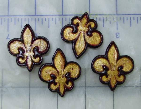
This is a close up of the paperclay Fleurs after the paint, gilding and crackle coat had dried. Still, it was brighter than I felt they should be, sooooo.......


I coated them with a very thin layer of the soft black paint and immediately rubbed it off. Now they appeared aged, as the rest of the piece would be as it moved forward. I apologize for the quality of this photo; for whatever reason the auto-focus did not like the crackle finish.....go figure......


And here I have laid out the paperclay elements (to get an idea of how much more color the background would require) and I have also torn the edges of the tracing paper print, laid it where I wanted it and it is ready to be applied with heavy gel medium. Using the heavy with tracing paper allows for less wrinkling of the paper due to the smaller amount of liquid in the medium itself. Using a soft gel would have produced many wrinkles.


The background color has been intensified, as with the color in the circle. The image is now adhered, has a few paint highlights here and there, and I mixed some budgie grit with heavy medium for the texture in the corners, which also holds the paperclay pieces firmly in place. Normally I would use Golden's Pumice medium for this, but what I had left had dried, and being the impatient sort, I figured budgie grit would work as well.....and it DID. (and it saves me from having to purchase another product!)


This gives a better idea of the rough texture in the corners, and you can also see the depth of subtle colorwashes on the background. I assure you, there are many layers on there. I like bringing the color up slowly until it is *just right*.
Also, it is easy to see how the torn edges of the paper blend gently into the blue background.
The next installment will show the medium in the corners dried and painted.....
It's just like a soap opera...you don't get it all at once! I have to drag it out some! (so I can get the work done and the photos taken! LOL!!!)
And though this is at the bottom of the post, there are new WELCOMES on the followers list and I am delighted to have you here! Good golly, I am getting sooo close to 100 people....
I never would have dreamed.
Thanks to you all for reading and keeping me writing.
I bid you.....

Pax.